Feeder 2.0

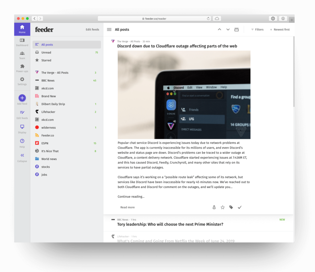
Today we are very pleased to announce the biggest upgrade to Feeder in a long time. We have rewritten the web reader from the ground-up. Feeder is now faster, simpler and easier than ever before.

Faster and easier to use
Three months ago we set out to overhaul the foundation of Feeder. Previously settings and the actual reader were under two different technical platforms. Now they are under one. This allows us to make a much more integrated experience and reduces build time for new features.
Improved navigation
The new sidebar makes it insanely more intuitive to navigate between the different aspects of Feeder. Your feeds, Feeder Dashboard, power-ups, teams, adding and editing content are now just one click away.

Focus on content
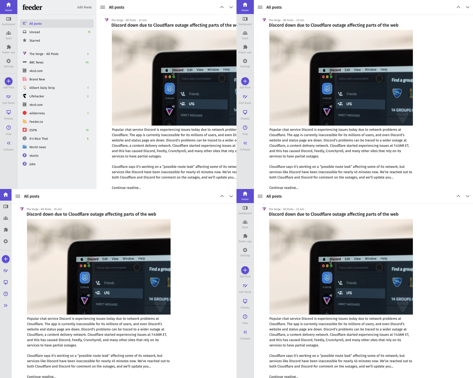
Focus for us is always on the reading experience. That is why we now allow you to collapse the sidebar to give more space for content. Also, collapse the menu to a clean icon-only menu.

Themes everywhere
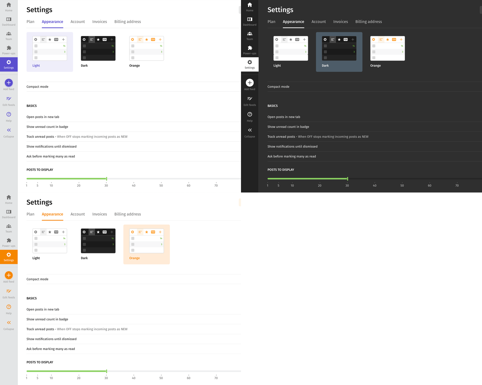
Previously themes were only active in the reader. Thanks to everything being under one technical platform we finally enabled themes in settings. It feels more integrated and is easier on the eyes if you have the dark theme.

Discover feeds
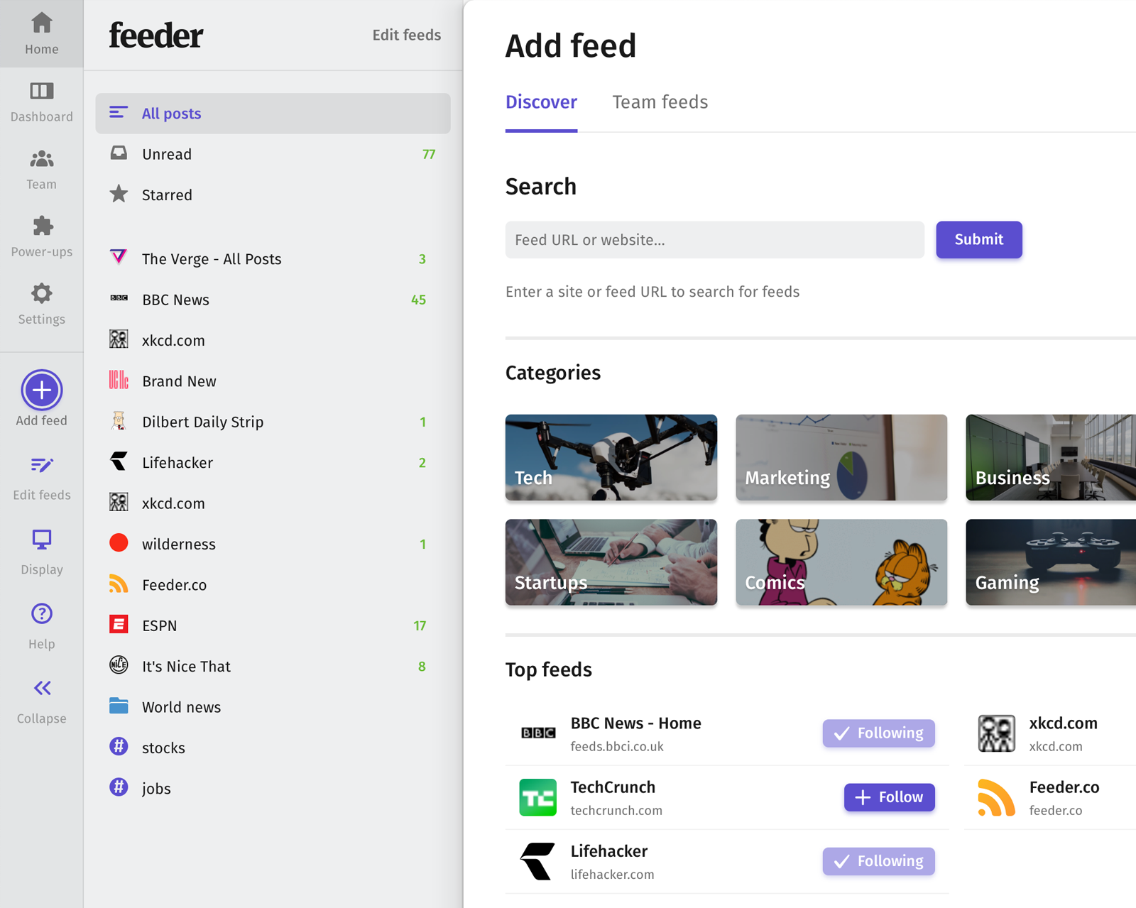
With our new discover tab it is easier than ever to find great content. Our top 1000 feeds have been tagged and categorised into browsable categories for a quick setup.
… and more
Full featured mobile web, functioning ctrl-f search, quick-access to post tools, keyboard navigation table, no-reload Dashboard, "All Posts" tab, improved scrollbars, collapsing feeds bar, full reader for extension only users and many, many more things.
Thank you
We would like to thank all beta testers who sent us feedback and bugs during the beta period. Without you all it would not be as great as it is today. So: Thank you!
If you have any questions, feedback or find bugs: we're always listening at support@feeder.co