A better browsing experience with new post lists
Today we are proud to announce the the first major release of 2023 - a brand new post list design that includes: images, previews, better visual hierarchy and more. It is an update that has been in the oven for a long time.
So what’s new?
Better visual hierarchy
The title of a post helps you find content you're interested in. That is why we made it the main element, located at the top to be the first thing you see. To enable this we shuffled the meta data to the bottom, including the unread indicator. This also allowed us to remove a large column of empty whitespace.
The unread dot
Feeder’s patented NEW indicator has been changed to a simple unread dot. It takes less space and does the job equally well.
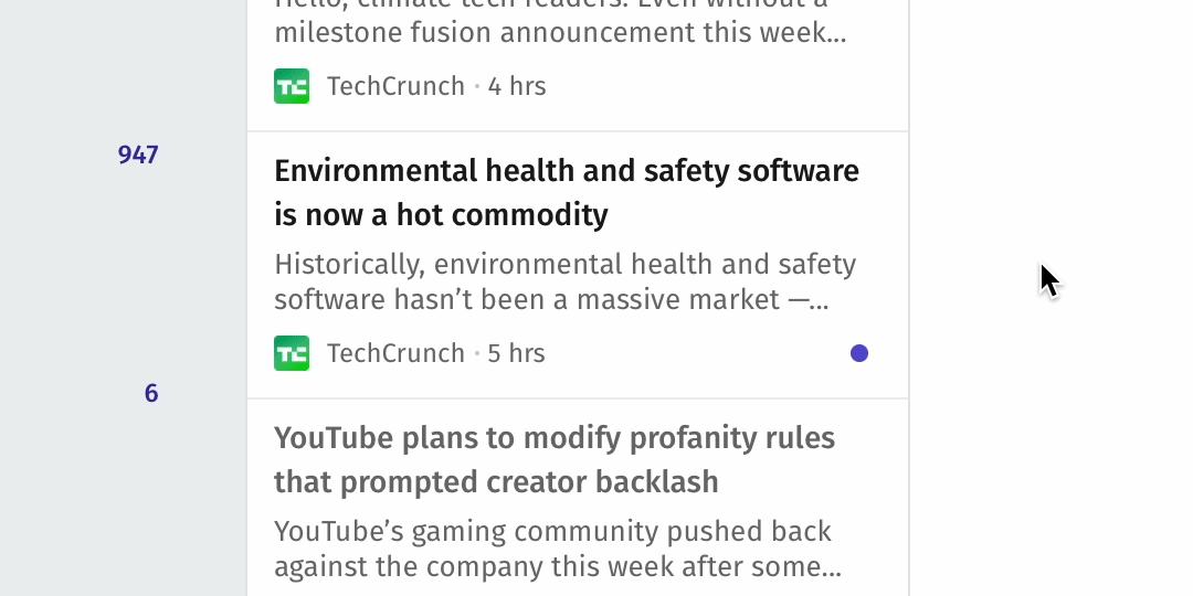
Images & Previews
Scanning posts is now easier than ever, thanks to the addition of images and preview texts. It helps you find interesting posts, and makes the experience more visual. If you prefer the "headline only" view, it's available under "Display" options.
Re-designed reader mode
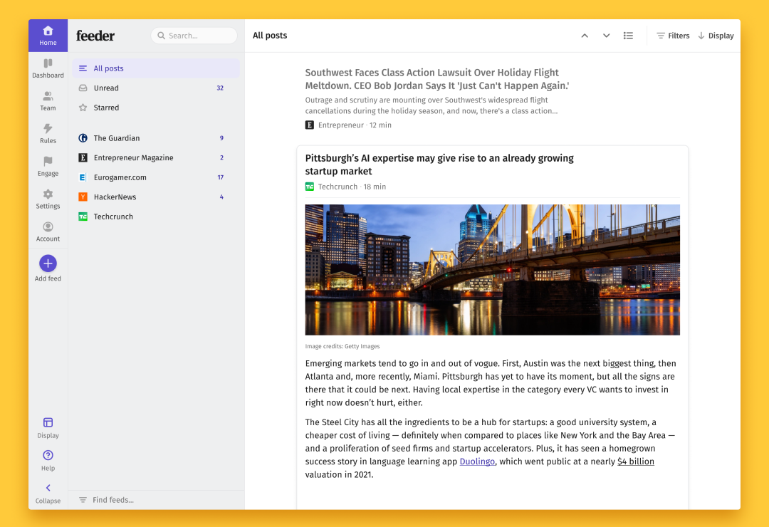
The biggest visual update hits the reader mode. By capping the width and centering the content, we believe the reading experience has improved tremendously.
Quick action bar
Manage your posts directly in the post list: mark as read, star, add to collection or share without ever opening the post. The new buttons also double as indicators.
Unified design
All these changes are pushed out to all post list variants, whether in dashboard, reader, 3-pane or minimal mode. No more confusion when switching between display modes.
We hope you'll love it
This is a big change, the post list is one of the most important items to help you find your favorite content. That’s why we would love to hear your feedback, so please send us any ideas, thoughts or bugs to support@feeder.co.
Happy browsing!